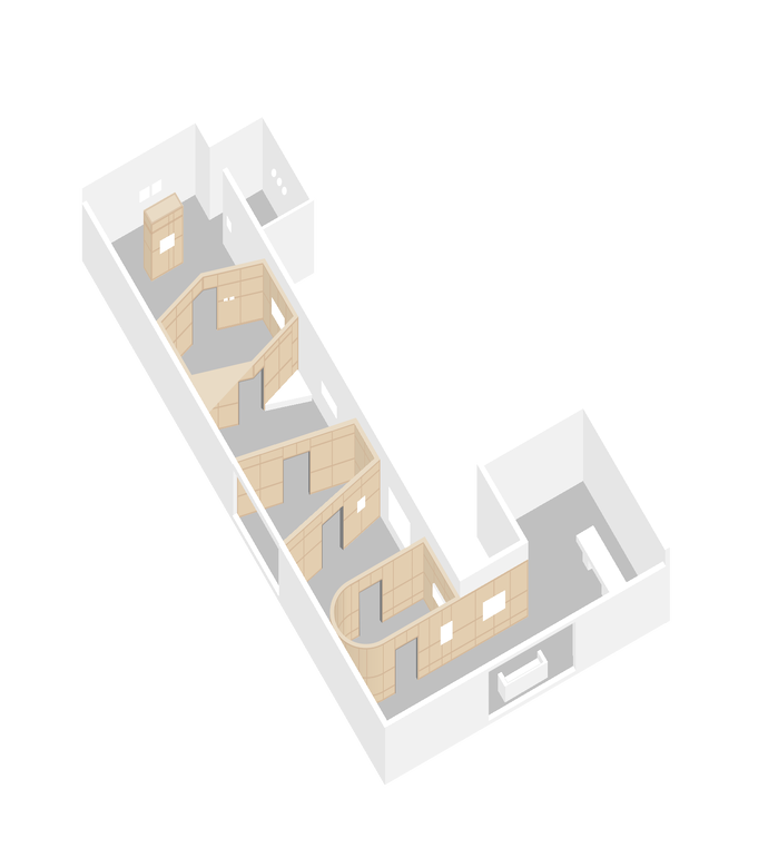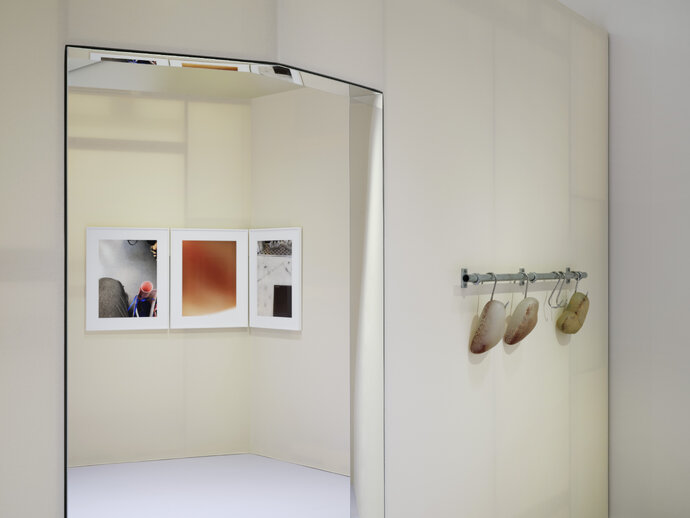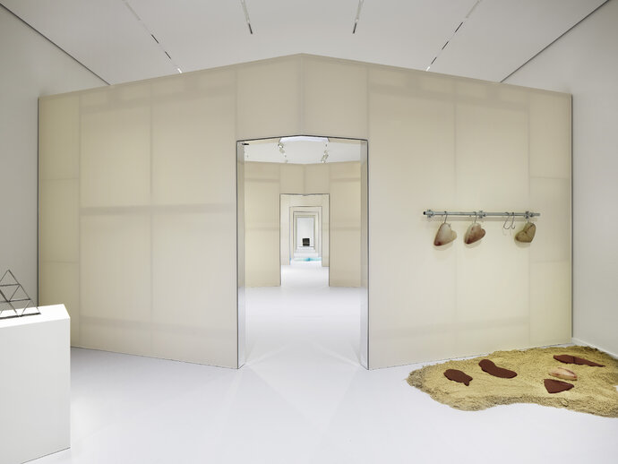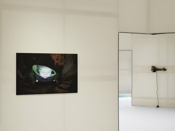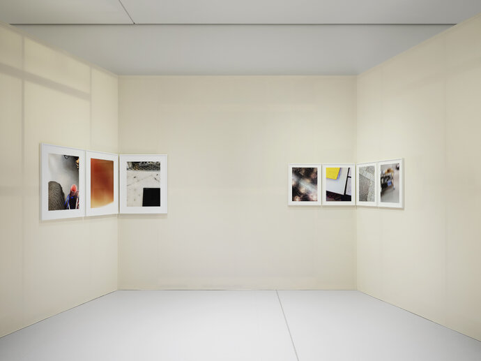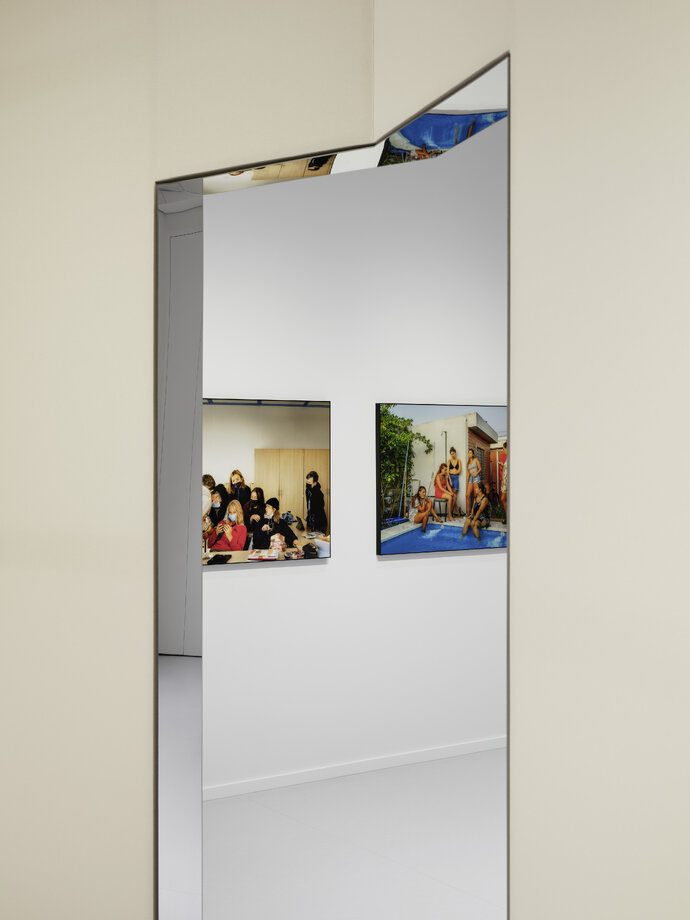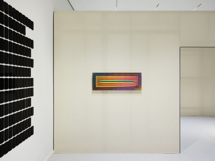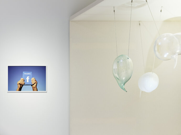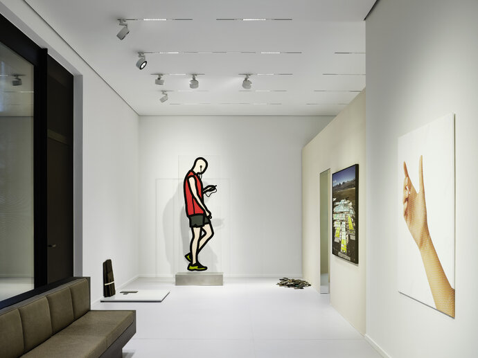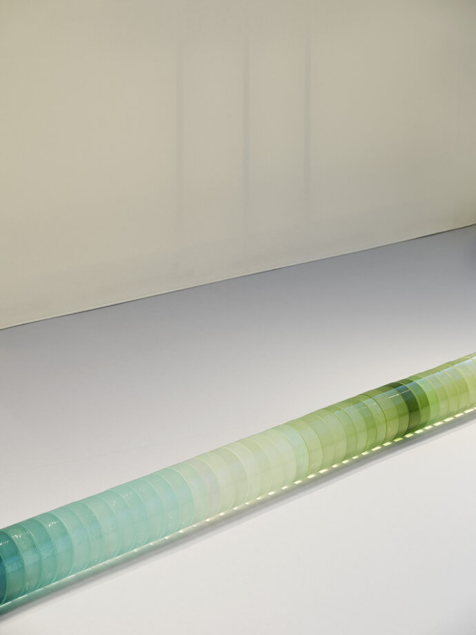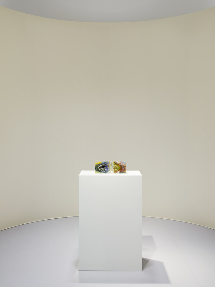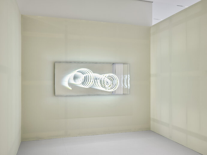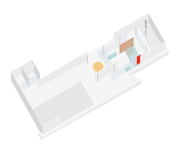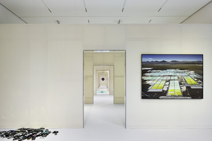


The idea for the exhibition design was to transform the unitary white box of the Alexander Tutsek Stiftung Gallery into a series of “rooms,” aligned along their centers, recalling the origins of public art display in old palaces. EBA also aspired to transform the material experience of the gallery space. Instead of the de-materialized white box - which aspires to become a neutral background – a material reality was proposed that heightens one’s awareness of the ways architecture mediates our experience of space and the perception of the art object itself.
Spatially, three material figures were inserted - one with a rounded apse, one which has converging walls and is defined by an existing garden window, and one which is a hexagonal shape. When one experiences these figures, one is either outside or inside of them: outside, the space is defined by existing gallery walls; inside, one experiences the materiality of the figural spaces.
With works from:
1: Edward Burtynsky, Zeller & Moye x Katie Paterson and Zsuzsanna Kóródi
2: Karin Sander and Ariane Forkel, © VG Bild-Kunst, Bonn 2024
3: Julija Pociūtė, Ariane Forkel, Zeller & Moye x Katie Paterson and Zsusanna Kóródi, © VG Bild-Kunst
4: Sergey Melnitchenko, James Akers and Zeller & Moye x Katie Paterson
5: Karin Sander, © VG Bild-Kunst, Bonn 2024
6: Valentin Goppel
7: Tornike Abuladze and Zsusanna Kóródi
8: Artem Humilevskyi and Alejandra Seeber
9: Ai Weiwei and Tillie Burden
11: Rebecca Ruchti, Julian Opie, Edward Burtynsky and Aram Bartholl
12: Zeller & Moye x Katie Paterson
13: James Akers, Shige Fujishiro and Zeller & Moye x Katie Paterson
14: Jeffrey Sarmiento
15: Brigitte Kowanz, © VG Bild-Kunst, Bonn 2024
| Location: | Munich, Germany |
| Year: | 2024 |
| Client: | Alexander Tutsek Stiftung |
| Scope of work: | LPH 1-8 |
| Photography: | NOSHE |
| Team: | Ester Bruzkus, Peter Greenberg, Anna Kopeina |
| Awards & publications: |
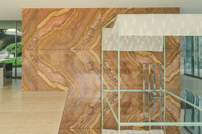
EBA’s installation of reflective and colorful surfaces reinforces the reading of the Barcelona Pavilion as a hall of symmetries: book-matched stones, glossy reflections, material joints at the eye-level horizon – emphasizing what critic Robin Evans referred to as “paradoxical symmetries.” The mirrored surfaces and colored objects that EBA added double the symmetrical conditions and make explicit what is implicit in the original design.
Mies van der Rohe and Lilly Reich had created a design that emphasized the nature and effects of the materials they used – by using reflective and transparent materials, they made a space where one can simultaneously see oneself in the reflection, see what is behind, and see what is ahead. These material reflections are reinforced by the locations of stone joints - in particular the horizontal line of the original onyx wall, which falls exactly halfway up the wall and occurs at eye-level, establishing a horizon line that appears as a mirror image of floor and ceiling. The effect is to blur the classical definition and perception of space. Further symmetries are established at the ground plane by the reflectivity of the shallow pools of water.
By replacing the original opaque black carpet with a shallow reflective box on the floor, and by inserting three additional boxes - two with mirrored surface and one, a thin colored outline, EBA temporarily transformed the Pavilion to reinforce the reading of these doubled surfaces and the perception of expanded spaces. A large circular curry-colored carpet and a green outlined steel cube were added to further the dialogue between the geometries and colors of the original Pavilion.
We hoped to reinforce the reading of the Pavilion as a kaleidoscope, a Hall of Mirrors.
| Location: | Barcelona, Spain |
| Year: | 2023 |
| Scope of work: | LPH 1-8 Interior Design |
| Photography: | La Dichosa |
| Team: | Ester Bruzkus, Peter Greenberg, Anna Kopeina |
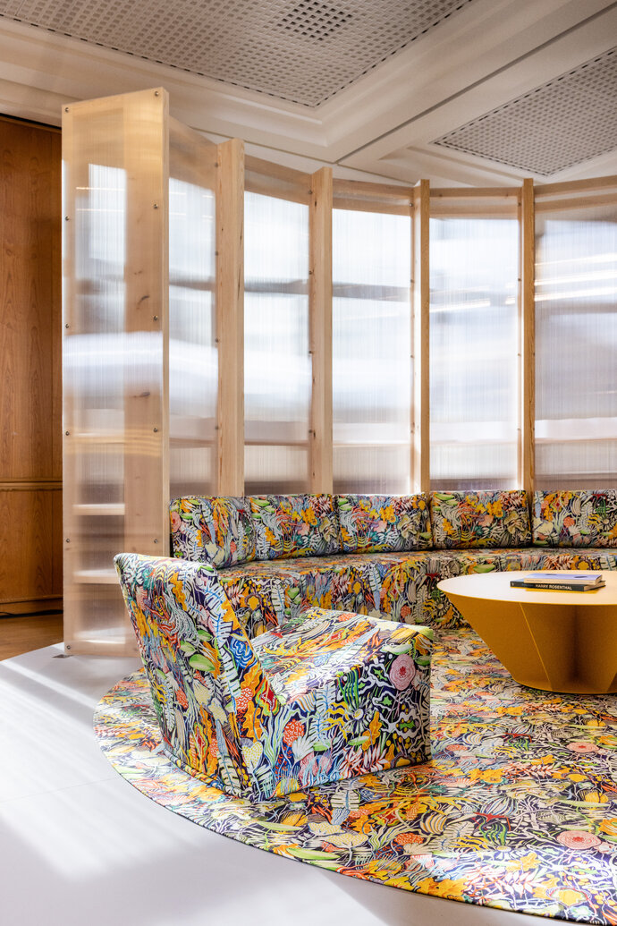
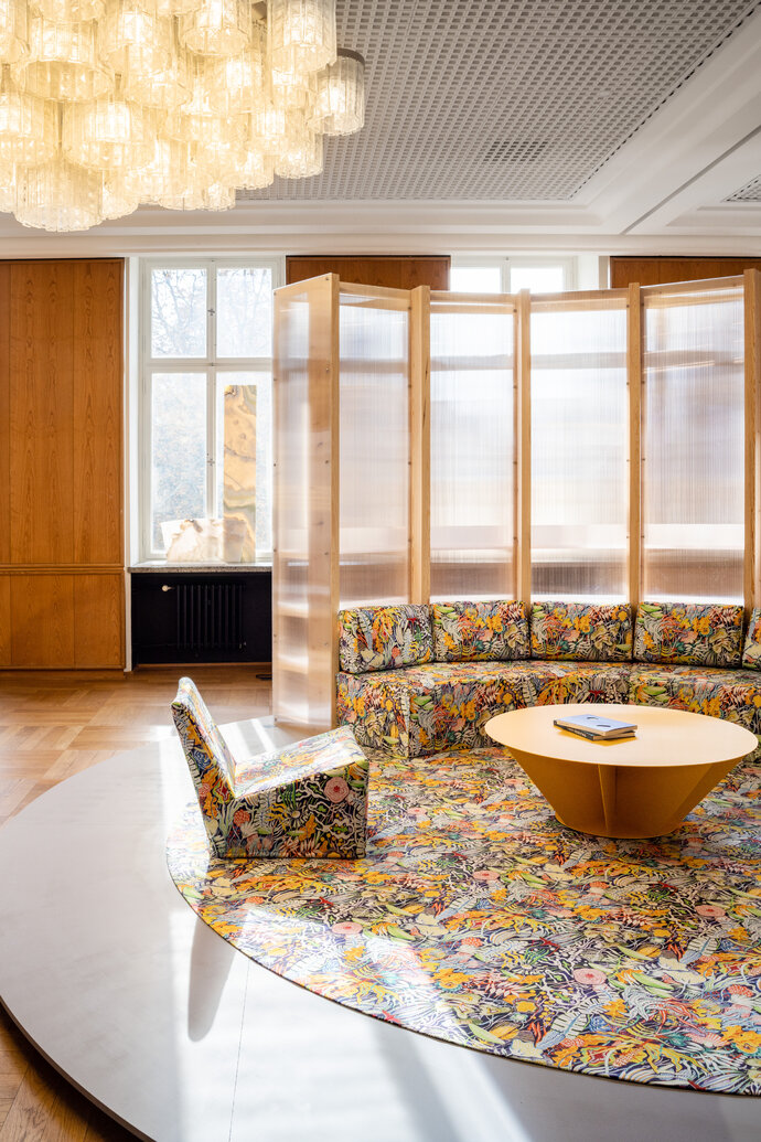
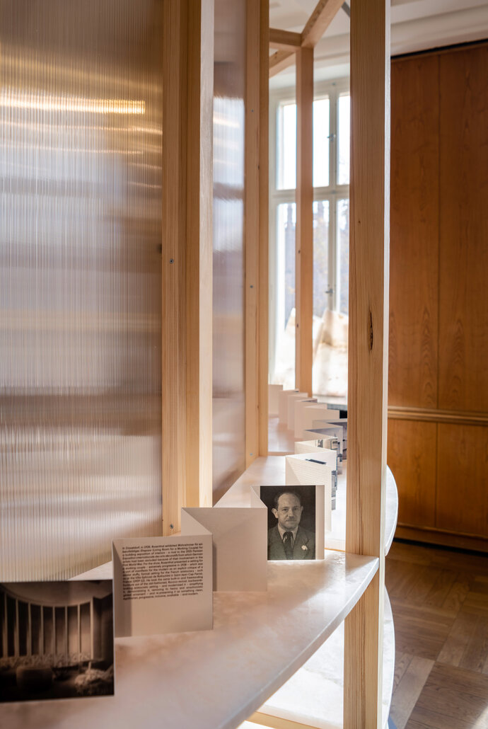
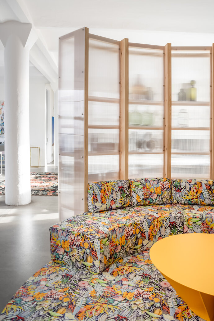
The “Living Room for a Working Couple’s Office” is a combination of architecture and furniture that brings some of the comfort of home to the office - and also an homage to Harry Rosenthal, the largely forgotten Berlin-based architect who practiced in the 1920s. EBA first installed the piece at the 2022 exhibition “AD New Perspectives” at the Kronprinzenpalais in Berlin but the project was always intended for two other sites - one piece became part of EBA’s office and one piece part of Ester and Peter’s home.
When they were asked to participate in the show for Architectural Digest to represent great German contemporary design, they thought of a similar challenge that Rosenthal had faced in 1928. Back then, Harry Rosenthal had exhibited an interior setting that combined architecture and furniture that he called “Wohnzimmer für ein berufstätiges Ehepaar” (Living Room for a Working Couple) – extremely progressive and inclusive for the era. For Rosenthal, the exhibit was a translation of a traditional built-in aristocratic setting for a “modern” couple - a critique of the stuffy, over-decorated furniture of the time, and re-presenting it instead as something clean, egalitarian, progressive, inclusive, available – and modern. Just as Rosenthal translated this setting to comment on his own era, EBA transferred the living room to their office to bring the advantages of the home office to the work place.
The second piece from the AD New Perspectives show, a delicate bookshelf of powdered steel and exquisite transluscent onyx, was installed in Ester and Peter’s apartment. The thin lines of the steel align precisely with the seams of the overhead precast concrete ceiling, extending Rosenthal’s ideas of subordinating all furnishings to the design idea derived from the architecture of the room.
| Location: | Berlin |
| Year: | 2022 |
| Client: | Architectural Digest |
| Scope of work: | LPH 1-8 Interior Design |
| Photography: | Jens Bösenberg |
| Team: | Ester Bruzkus, Peter Greenberg, Yining Liu, Giulia Di Marco |
| Partner: | Pierre Frey, Solid Nature, Matthias Hickl |
| Awards & publications: | AD Magazine |
WINNER of the 2019 FRAME Magazine Awards Entertainment Venue of the Year!
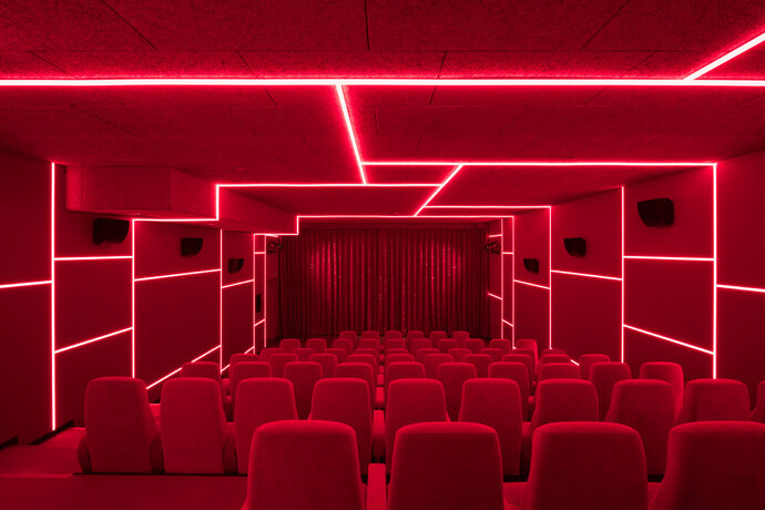
Located among the art and cultural institutions of West Berlin’s Banhof Zoo district, the distinctive cinema for the Yorck Gruppe is designed as a new cultural landmark for independent film. The design concept was to make each hall excitingly different to challenge the idea of a room for cinema as a neutral “black box.”
Each cinema hall has its own colorful and surprising identity, though they are united by careful design details and thematic variations. The inside of each of the screening rooms has its own identifying color and its own characteristic lighting pattern. The interior of one is a deep “theater red”; another is blue, another green, another is pitch black. The exterior of the halls also have their own identities and acta s a kind of individual storfront for each room: the wall of one hall is covered with hand-painted wooden tiles in various shades of pink, while another is covered with knotty pine cladding; others use transluscent polycarboate sheets that refract signage lighting . Textile wall coverings expertly hide sound distribution and dampening materials, ensuring optimal sound separation and audio quality.
Thin strips of lighting are arranged in angular patternst that do not necessarily correspond to the geometry oft he rooms. This lighting strategy unifies the inside of the cinema halls with the public corridors. In the evenings, when the cinema is full of patrons, these striplight reflect in the exterior glass walls to create mirrored patternst that appear to float on the opposite city walls.
The cinema has seven screens, six hundred seats, an extensive public lobby, and two service areas.
| Location: | Berlin, Germany |
| Year: | 2017 |
| Client: | Yorck Gruppe |
| Photography: | Marcus Wend |
| Team: | Ester Bruzkus, Patrick Batek, Martina Durrant, Minwon Kim (for Bruzkus Batek) |
| Awards & publications: | db |
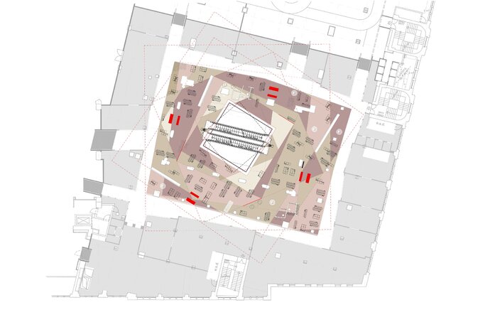
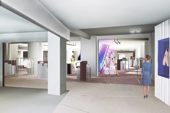
The design of the interiors for the KaDeWe Flagship Retail for the contemporary women’s fashion department is an ongoing collaboration between Ester Bruzkus Architekten and Batek Architekten. The project will transform the inside of Berlin’s premier department store by creating a new marketplace in the European tradition of innovative urban retail architectures: market squares, plazas, arcades, and high streets. These dense centers of exchange are defined by edges, paths and colorful displays and the new planning introduces a contemporary vision of a "street" between "façades" of contrasting materiality, surrounding an open "marketplace" - all marked by color, texture, transparency and reflectivity.
The design begin with OMA’s Master Plan which separates the building into four quadrants, each with its own distinctively geometric atrium. The planning of the fashion area rotates and overlaps the OMA square to offer users angled views and to establish inner and outer planning zones. The outer zone will be defined by façades for the different brands that will have distinctively different material presences: metals, polycarbonates, laminates, colored glasses, etc. The inner zone becomes a "marketplace" of lower, more open and transparent fittings.
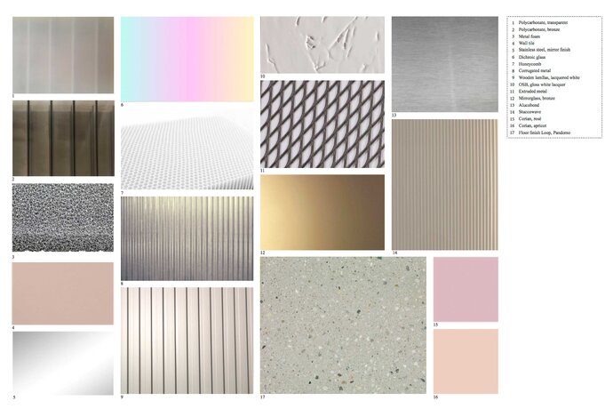
The overall space will have a distinctive material presence: major separation walls will be made from polychromatic glass which change their level of transparency based on where one views it from. Each shop facade will be composed of its own distinctive material. The bespoke furnishings of the interior will screen off the atrium to make rooms-within-rooms that simultaneously create transparency and space definition. The rich material palette of extruded and foamed metals and resins is contrasted with special polychromatic elements to suggest featured moments of product presentation.
| Location: | Berlin, Germany |
| Year: | 2016-ongoing |
| Client: | KaDeWe |
| Area: | 1 945 sq m |
| Team: | Ester Bruzkus, Patrick Batek, Anke Müller |
| Partner: | Batek Architekten |
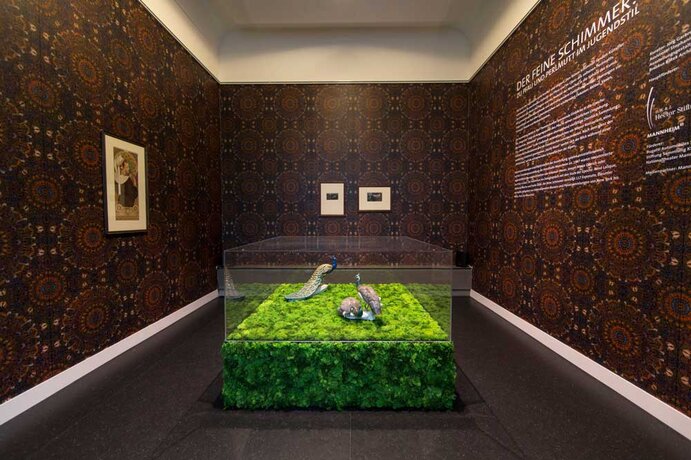
We developed a tailor-made architecture for the exhibition "The Delicate Glow", which is dedicated to beauty.
The spaces of 1907 have not been rebuilt, but associations set it up. The "Library" refers to former "Study"; The "Vanity room" is based on space of lady. For example, in entire long side of Library is covered with display shelving, which equipped with the February issue of magazine "Jugend" of 1906, the title of "pea hen“ by Leo Putz (1869-1940), and art-Nouneau font of Otto Eckmann (1865-1902).
| Location: | Mannheim, Germany |
| Year: | 2015 |
| Client: | Kunsthalle Mannheim |
| Area: | 330 sq m |
| Scope of work: | LPH 1-8 Interior Design |
| Photography: | Alina Holtmann, Laura Brechtel |
| Team: | Ester Bruzkus, Sarah Przibylla, Alina Holtmann (for Bruzkus Batek) |

